
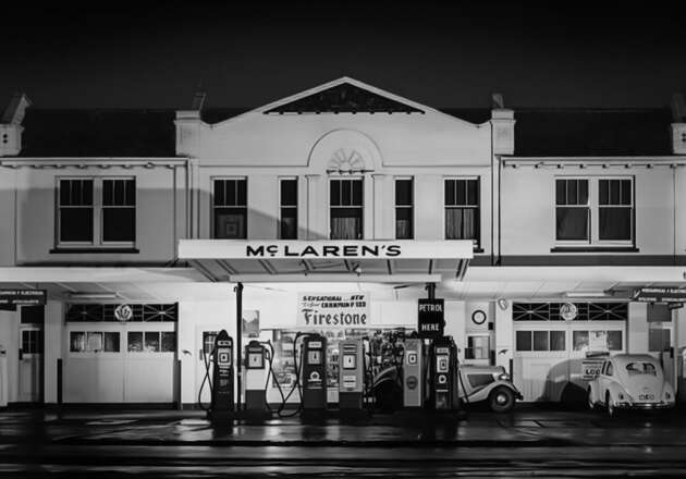


McLaren has revealed a new brand identity, and for the first time in the company’s 63-year history, it references the founder rather than a sponsor. The centrepiece is a new wordmark drawn from the sign that hung above the McLaren family’s service station on Remuera Road in Auckland, New Zealand – the 1920s garage where a teenage Bruce McLaren rebuilt an Austin 7 before taking his first motorsport win at Muriwai Beach.
The wordmark is rendered in a custom typeface called McLaren Sans, with a subtle underscore beneath the lowercase ‘c’ – a nod to the old garage signage – and a deliberately lighter weight that gives it the polish of a luxury fashion label. It will appear on the tails of future cars and across everything else the company puts its name on, and notably, this is the first identity adopted by both McLaren Automotive and the McLaren Formula 1 team simultaneously.
“Finally, an acknowledgement of our founder,” said chief creative officer David Woodhouse of the change, following what he described as a period of not recognising Bruce McLaren. He was also firm that the new identity should not be called retro, saying the wordmark “definitely takes dominance.”

That last point addresses the obvious question – what happens to the Speedmark? The swoosh that has fronted McLaren’s road cars since 1997 survives, but is demoted to a secondary role, described as “a little identifier”, and reintroduced for the brand’s racing and golf sub-brands. The Speedy Kiwi of the 1970s lives on too, reserved for details such as fuel caps. There’s also a new colour palette – Papaya, Ember, Midnight, Black, Anthracite, Colnbrook and Mist – with the hues drawn from a photograph of Bruce McLaren, and Colnbrook silver named after the company’s first UK base.
The first car to wear the new badge will be the McL 6GT, the 1960s-inspired manual V8 supercar due for production in 2028 – the new identity made its quiet debut alongside the car at Monterey Car Week in August.

McLaren’s upcoming SUV, due before 2030, follows. Current models like the Artura, 750S and GTS are set to retire by the end of 2028, and it’s unclear if they’ll ever receive the new lettering – which could make the W1 flagship among the last McLarens to carry the old logo.
Corporate rebrands in this industry are a minefield – Jaguar’s “Exuberant Modernism” makeover showed how quickly a misjudged identity can cost a carmaker public goodwill. Early design-world reception for McLaren’s effort has been considerably warmer, with critics praising the balance of heritage and modernity, even if the fashion-house sleekness is a world away from a race team’s grease and papaya. What do you think – dignified return to the founder’s roots, or another supercar maker gone minimalist? Let us know in the comments.
The post McLaren reveals new logo based on wordmark from Bruce McLaren’s family garage sign appeared first on Paul Tan’s Automotive News.
